Colour Context Cards — 12 Simultaneous Contrast Studies
A downloadable project
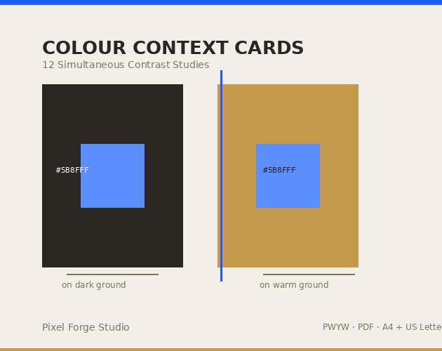
In 1963, Josef Albers proved what every designer eventually learns the hard way: colour has no fixed identity. The same hex value looks warm on one ground, cool on another. Light on dark. Muddy or crisp. You're not choosing a colour — you're choosing a relationship.
These 12 reference cards make that relationship visible.
Each card presents a single hue placed on two grounds: one light, one dark. Identical swatches, different perceptions. Hex codes printed beneath each swatch so you can reproduce the conditions in your own work.
Use them when:
- A palette looks perfect in isolation and falls apart on the page
- A client says "that's not the right blue" and you need to show why context is the variable, not the swatch
- You're teaching colour theory and need a hands-on demo that isn't a lecture
What's included:
- 12-page PDF (A4 + US Letter, both included)
- One simultaneous contrast study per page
- Hex codes, colour names, and a one-line perception note on each card
- Printer-friendly: black ink only for grounds, colour swatches print accurately on any colour-managed printer
Licence: Personal and commercial use. Print as many as you need.
Based on principles documented in Josef Albers, Interaction of Color (Yale University Press, 1963). These cards are original Pixel Forge Studio work applying those principles — not a reproduction of Albers' book.
Purchase
In order to download this project you must purchase it at or above the minimum price of $5 CAD. You will get access to the following files:
Leave a comment
Log in with itch.io to leave a comment.